Client: Unibail-Rodamco-Westfield
Architect: MVSA, Amsterdam
Lightingdesign: Ulrike Brandi Licht
Completion: 2021
Westfield Mall of the Netherlands
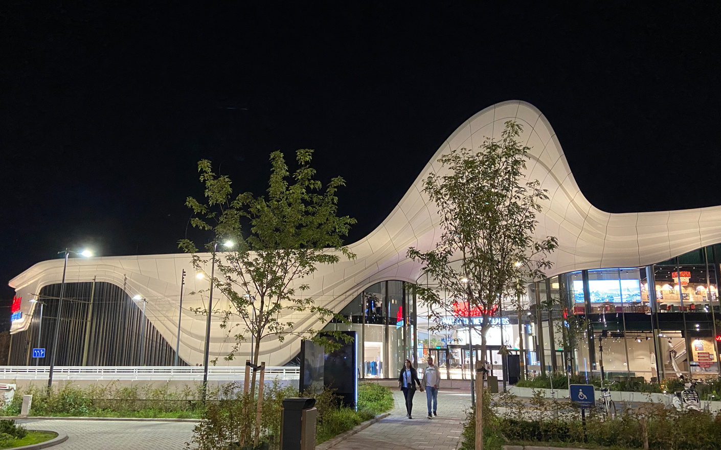
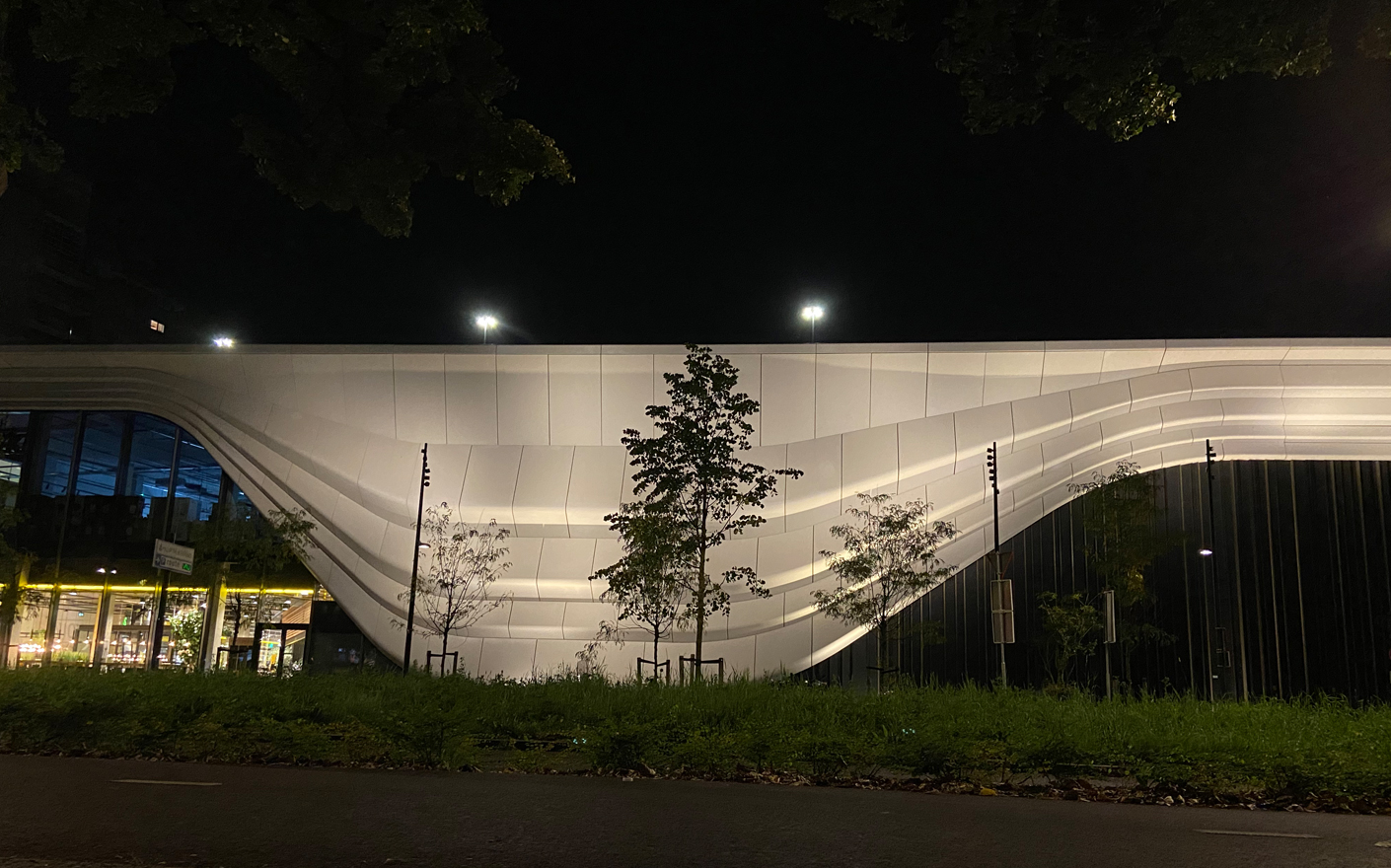
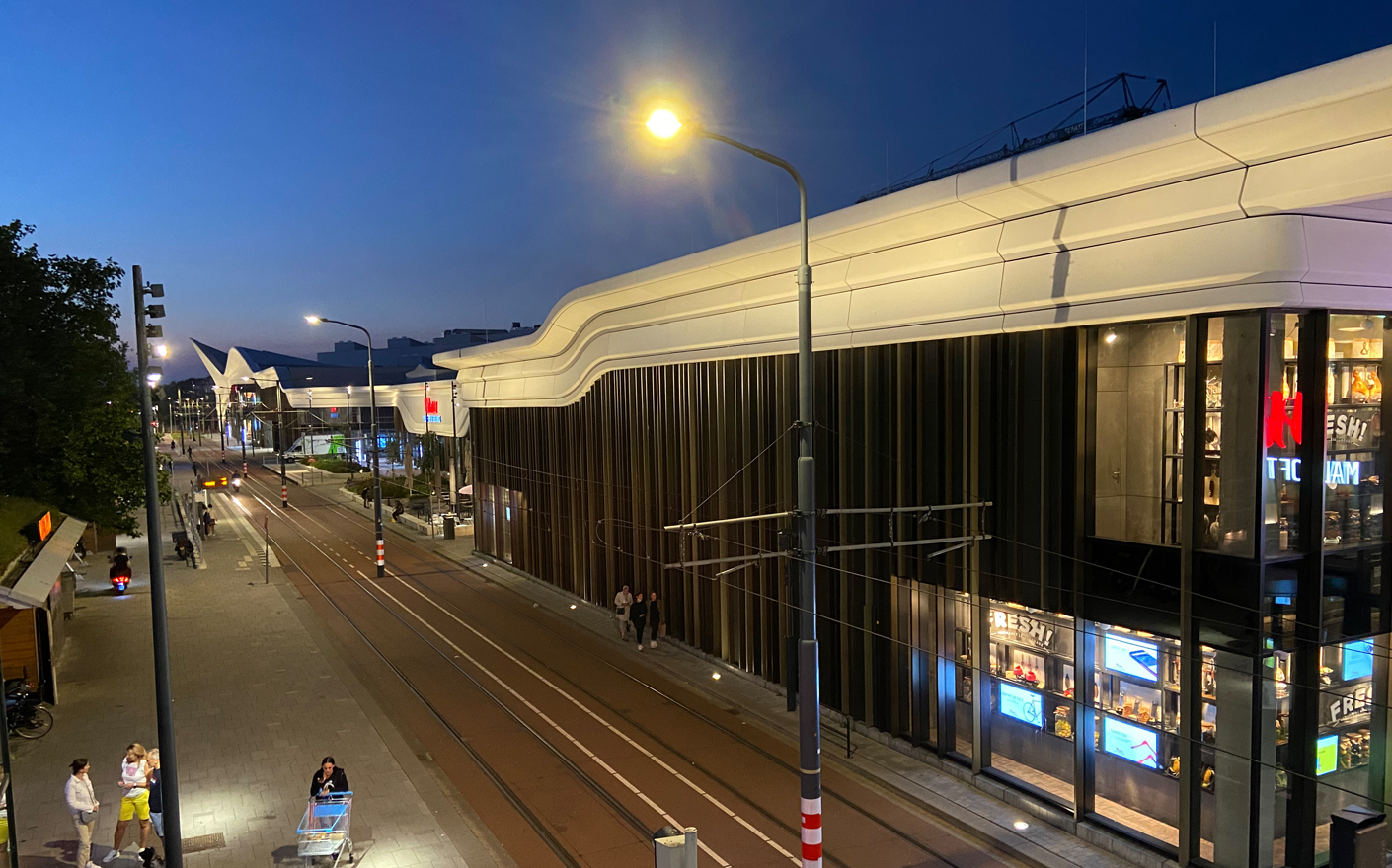
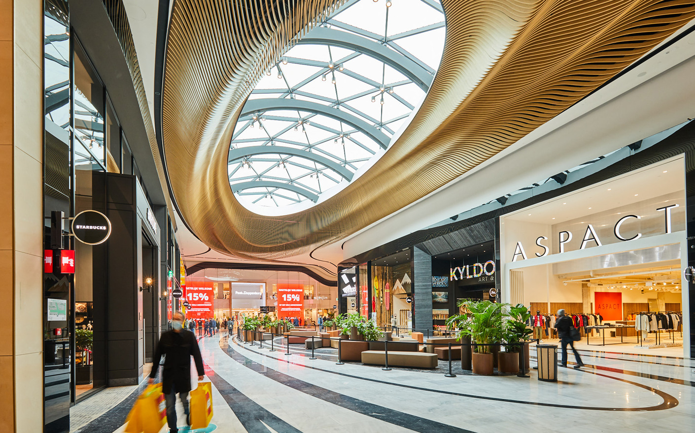
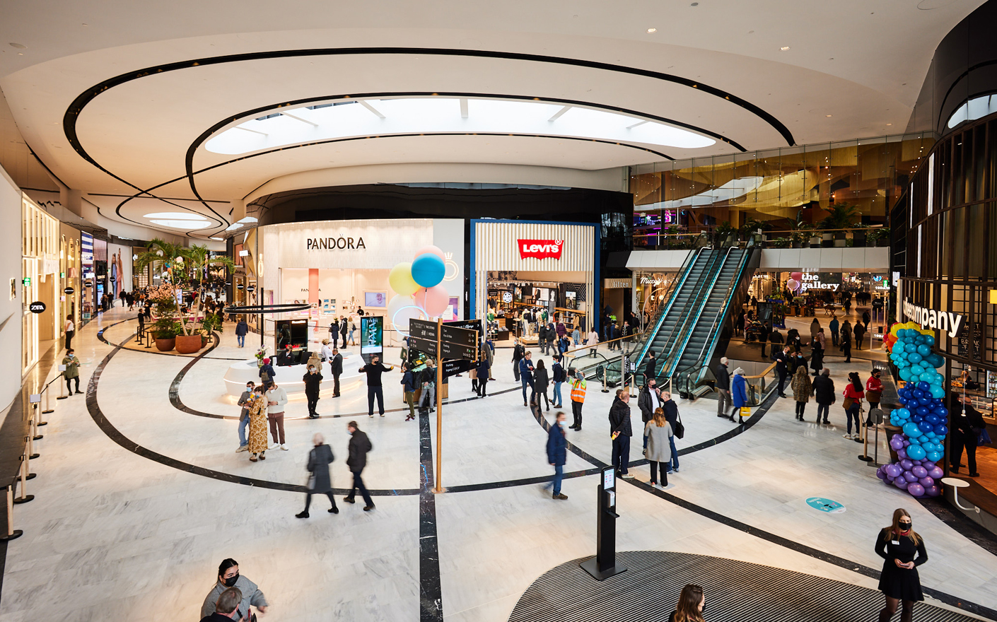
The Mall of the Netherlands was created from an existing shopping centre in Leidsenhage near The Hague. The architects gave it a roof and a waving white scarf as a façade, and in the mall the curved footpaths now continue from the outside to the inside. In this way, landscape and building are organically connected.
A pleasant lighting atmosphere that includes various natural light situations during the day, evening and night strengthens the district and the mall embedded in it and gives it its unique identity.
Outside, light accents on vantage points, plant islands and axes help people find their way. By not diffusing too much light into the landscape, the façade has a pleasant but not overly bright effect, even with small amounts of light. The characteristic wave-shaped “scarf” that wraps around the building makes it a landmark. Dimming the light up and down creates the illusion of soft movement, as if triggered by the wind.
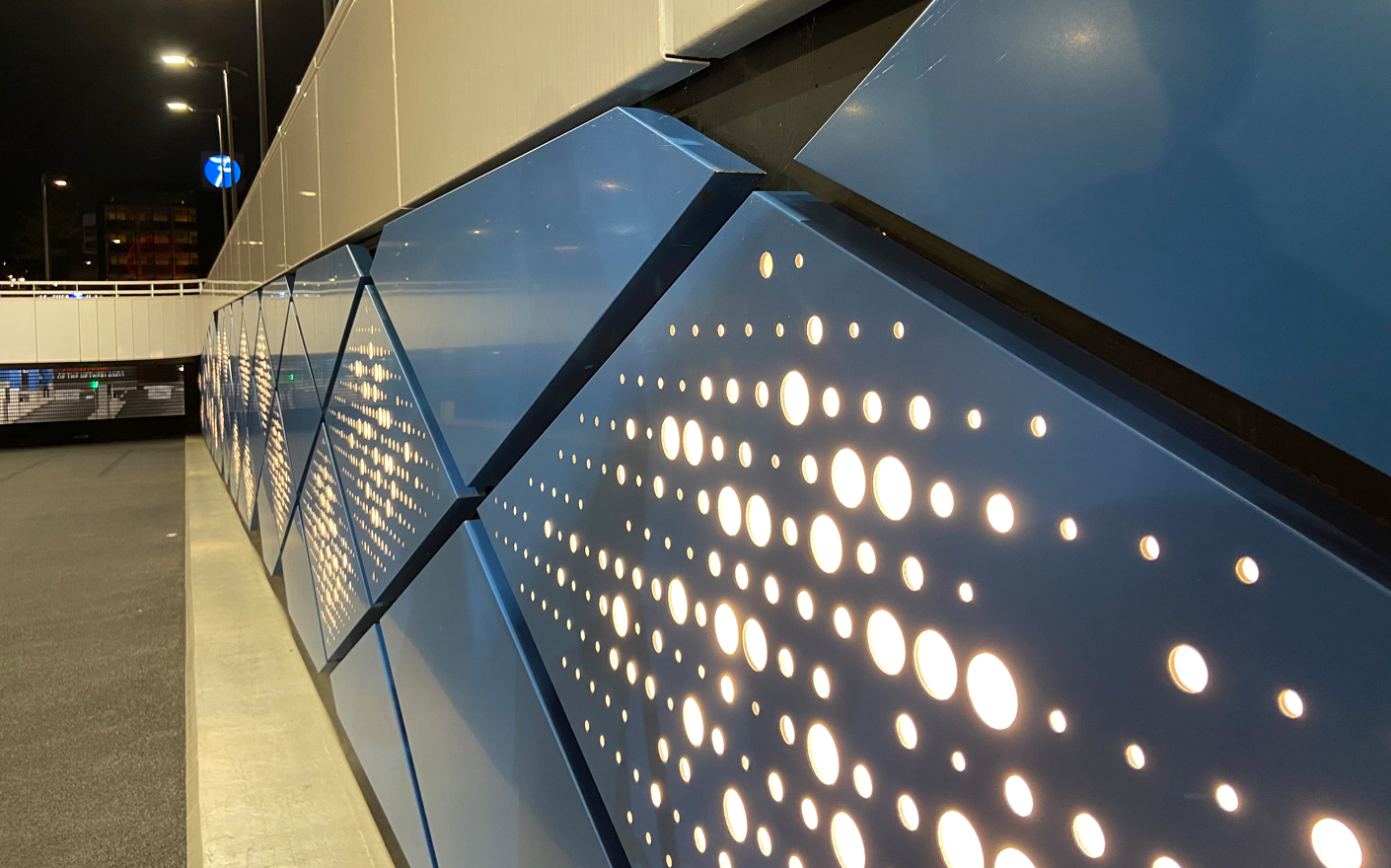
The parking garages as the large entrances to the mall are safe and friendly. Accentuated entrance areas, light walls that avoid “dark corners” create a sense of security and facilitate orientation.
The entrances from outside are inviting orientation points, their cantilevered roofs are clearly visible and perfect for targeted indirect light and projections. A “carpet of light” in front of the entrances reinforces the inviting gesture.
All the areas behind the Mall of the Netherlands appear brighter than the areas inside, especially during the day when people’s eyes have to adjust from the bright sunshine to the artificial light inside.
The skylights let the freshness of daylight into the mall to connect it with its surroundings and allow orientation. Downlights, housed in curved strips, create an attractive and vibrant direct light in the mall.
The Mall of the Netherlands was awarded the Breeam Gold certificate, and we made the contribution in terms of lighting.

